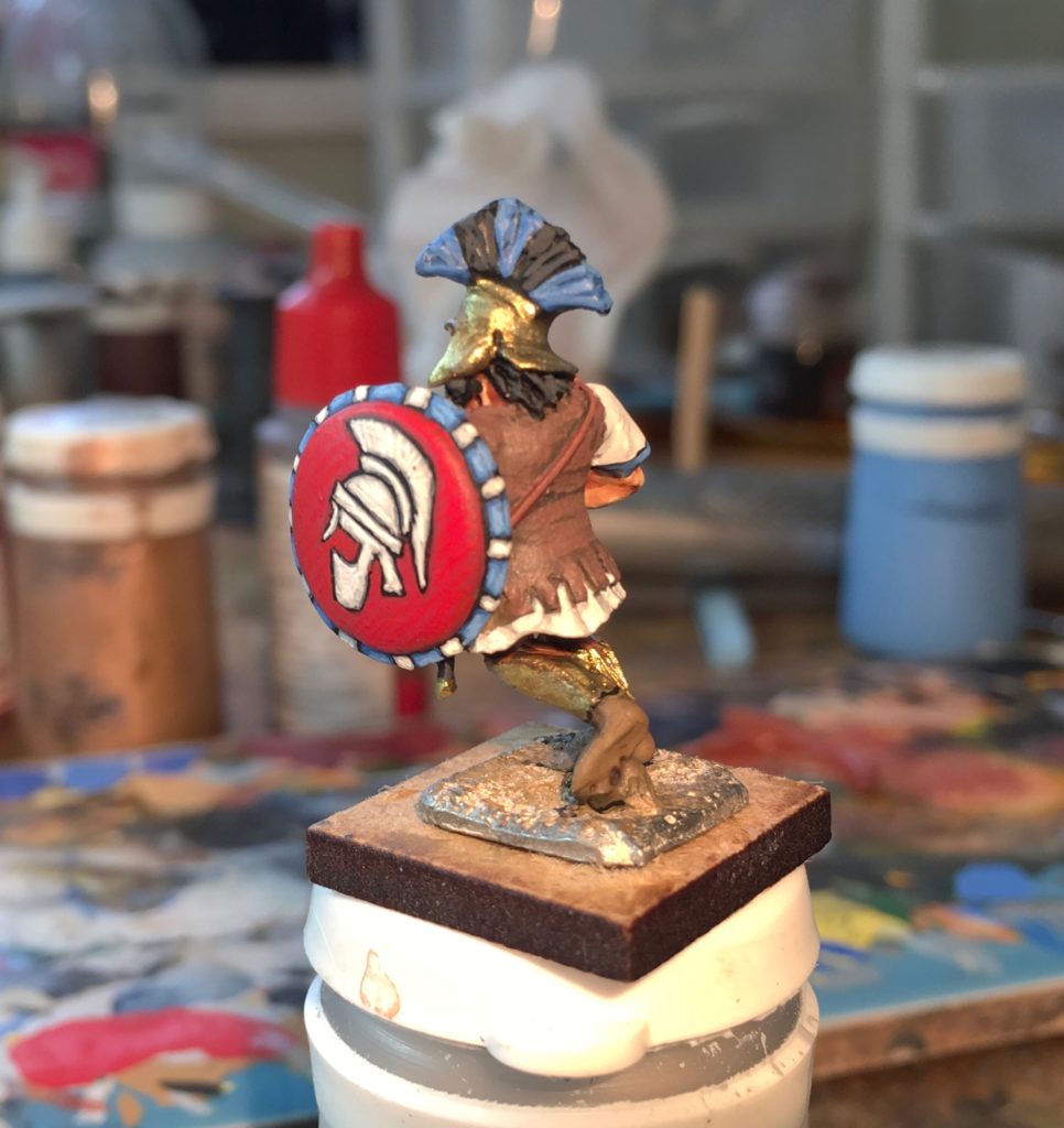
I’m just starting my next batch of hoplites and thinking about the shield designs, so thought I would share a step-by-step of my trial figure as I painted the shield design. The figure in the example is a Hinchliffe mercenary hoplite – a model which gives the advantage of a nice, large flat area to paint the shield emblem.
Why paint shield designs when there are so many excellent transfers around ? Firstly, my collection is a mixture of vintage figures which are nearer to true 25mm in size. Most transfers are designed for modern ranges and probably won’t be correctly sized. Secondly, there is a satisfying sense of achievement in hand painting your own designs, Most of my hobby time is spent painting so I do like to make things slightly difficult for myself and set myself unnecessary challenges – because I enjoy it. Most people will think this bonkers and use transfers. And they will be very sensible for doing that….
This is in no way a speed painting technique – the key is patience but once you have a unit painted then the effort repays itself!
I mostly paint using the three layer method over a black or dark brown undercoat so my approach is really just an extension of this. Initially I base coat the shield in the shade colour to be used for the background (in this case GW Mechrite Red) . Give this time to dry and cure properly- so that if you need to wipe the freehand painting it won’t lift the base coat at the same time.
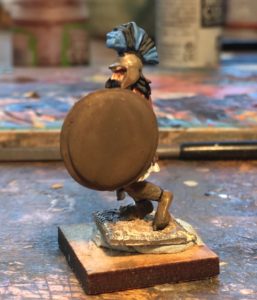
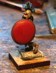
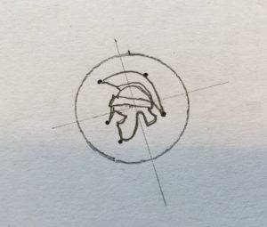
Then choose your design. I usually google hoplite shield images until I find one that I think I can manage freehand. Having selected a design I then try to sketch it out a few times with a pencil to get sense of how to simplify it and the relative proportions. The black dots on the picture below are the main boundary points that I need to get in roughly the right position to make sure it all stays to scale.
Now the trickiest bit which is to freehand paint the outline. I find that trying to outline it in pencil often just rips the paint – so I go straight to using the brush. The paint flows much easier with flow enhancer. For normal painting I don’t notice the difference but for fine detail it really makes the paint flow much more easily than plain water
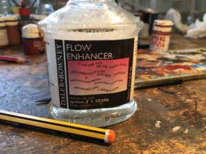
I rough out the outline of the design as per the pencil sketch. If you get it wrong at this stage then you can correct it with some acrylic thinner brushed on lightly until the mistake is wiped out (but be quick before it fully dries). Sometimes its easier just to wipe the whole thing and start again if messed up significantly.
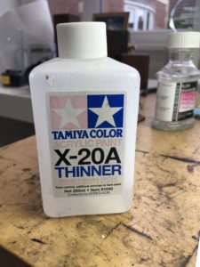
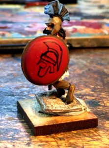
When you are happy with the outline then block it out in black so that you get a silhouette. It’s all downhill from here !
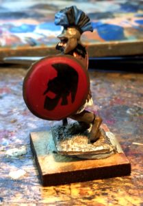
On this figure I’ve decided to paint the helmet white.So I first paint the main parts of the design inside the silhouette, leaving part of the black showing as a border, This is the Foundry Arctic Grey triad – three layers build up the colour depth.
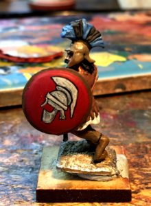
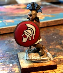
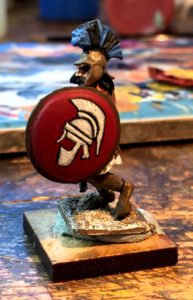
Once the symbol is complete its time to paint the next layers for the background – two shades of lighter red for this figure. Paint over the background base layer but leave a small gap around the emblem. This further delineates and emphasises the design.
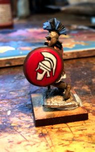
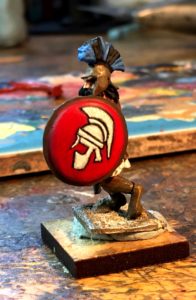
Adding a pattern to the shield rim further enhances the overall effect and really makes it pop. I tidy up the shield edge in black and then add a simple series of blue and white segments.
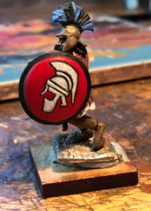
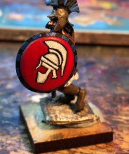
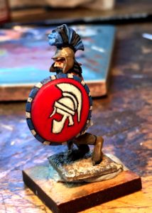
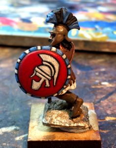
And its done. Only another 19 to go.,………..
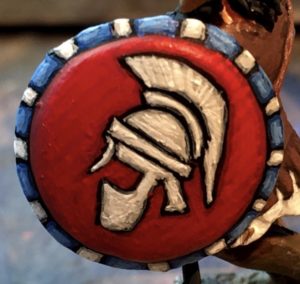
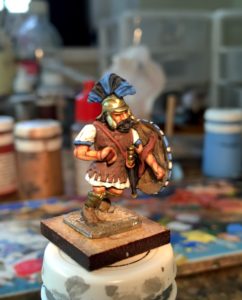
That’s rather spiffing, Simon. He’s a lovely old figure and you’ve done him proud.
I heard what you said about the spear hand on Henry’s podcast and now I see what you mean. Ouch! I would have to fix the spear first and build up the hand before painting. You’re brave doing it this way.